What This Is
A full operational intelligence system for a logistics company, built from a raw dataset using SQL for data cleaning and database modelling, then Power BI and DAX for the visualization and calculated measures layer. Eight dashboards, each answering a distinct operational question a logistics business actually needs to run.
The brief was analytical. The thinking behind it was product: what does a logistics operations manager need to see to make good decisions, and how do you structure that across eight views without losing the thread between them?
"The brief was analytical. The thinking behind it was product: what does an operations manager actually need to see?"
8
Dashboard Tabs
124
Active Drivers Tracked
120
Fleet Trucks Modelled
200
Customer Accounts
The Dashboard · All 8 Tabs
Interactive Preview
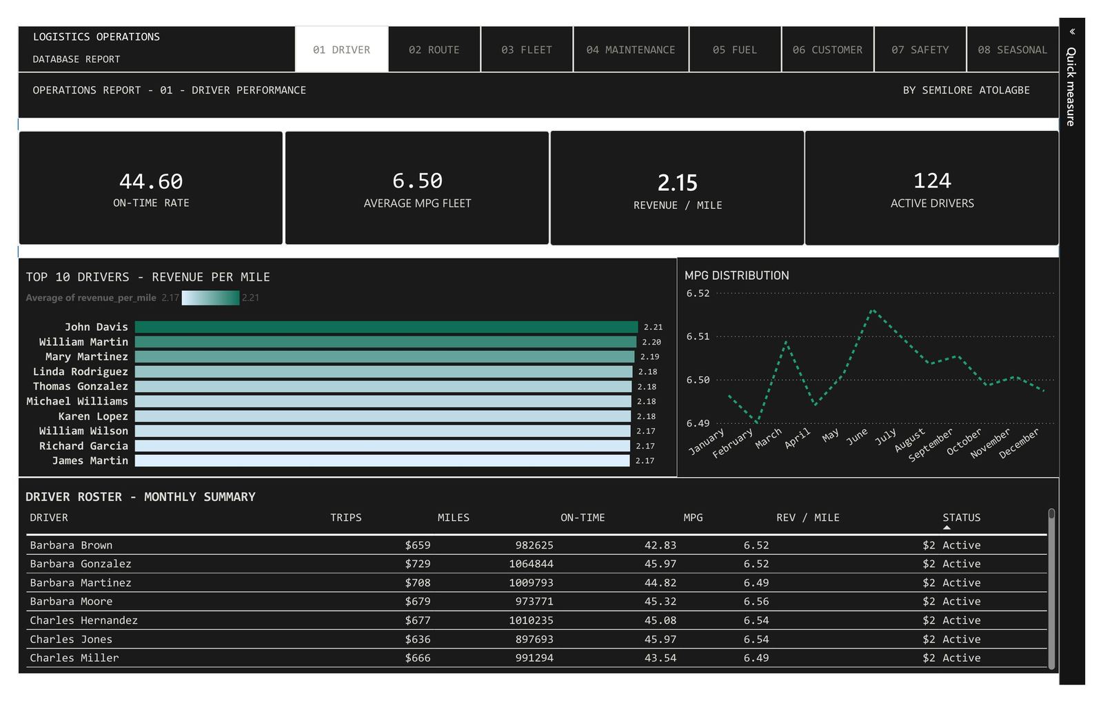
01 · DRIVER PERFORMANCE · Top 10 by revenue/mile, monthly MPG distribution, full roster
Rev/Mile: $2.15 avg · 44.60% on-time rate
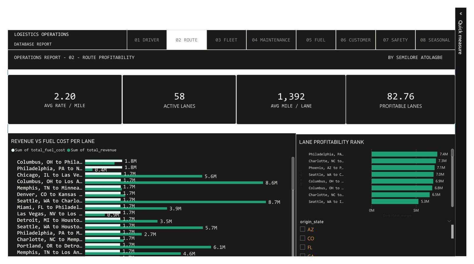
02 · ROUTE PROFITABILITY · Revenue vs fuel cost per lane, net margin ranking by origin state
58 Active Lanes · 82.76% Profitable
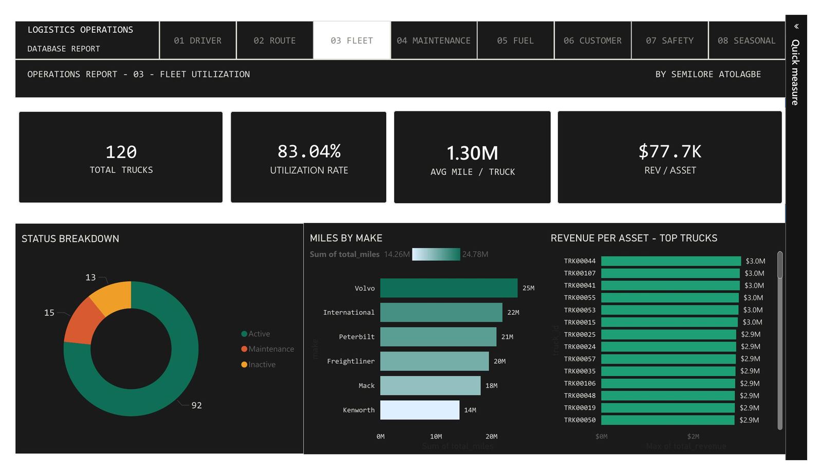
03 · FLEET UTILIZATION · Miles by make, revenue per asset, status breakdown across 120 trucks
83.04% Utilization Rate · $77.7K Rev/Asset
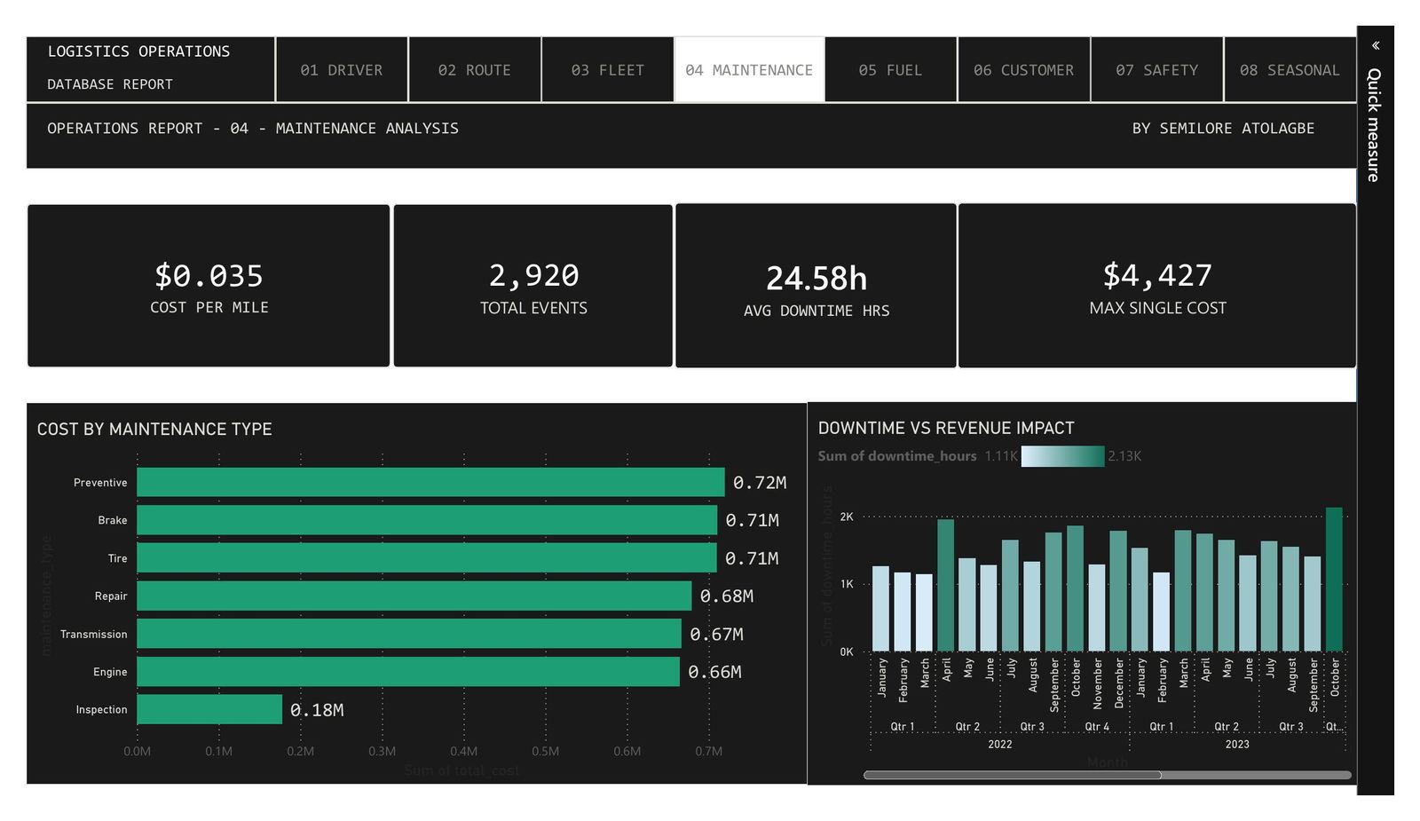
04 · MAINTENANCE · Cost by type, downtime vs revenue impact across 2022–2023
2,920 Events · $0.035 Cost/Mile · 24.58h Avg Downtime
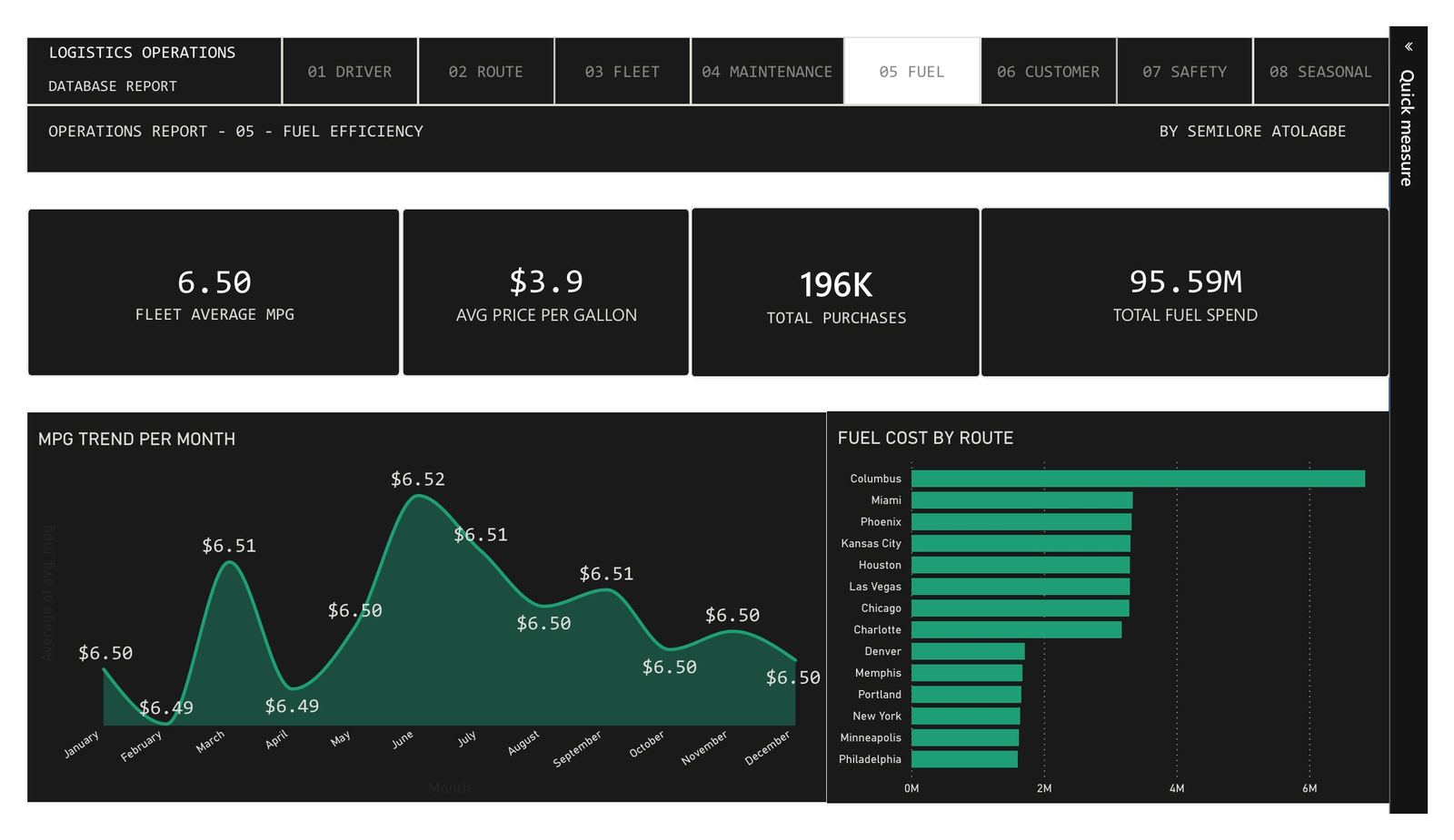
05 · FUEL EFFICIENCY · MPG trend per month, fuel cost by route origin, 196K total purchases
$95.59M Total Fuel Spend · $3.9 Avg/Gallon · 6.50 Fleet MPG
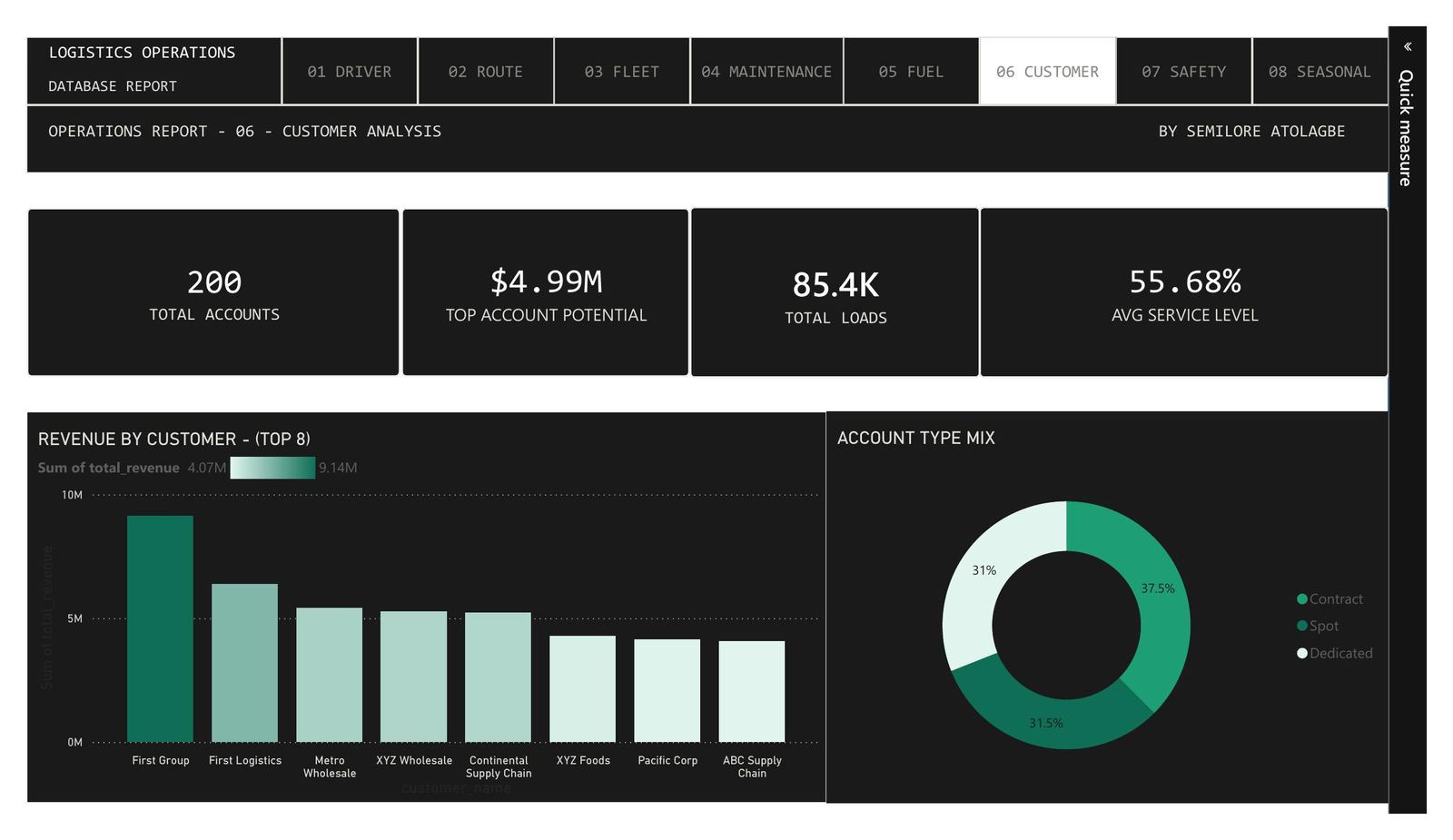
06 · CUSTOMER · Revenue by account, account type mix (contract/spot/dedicated), service levels
200 Accounts · 85.4K Total Loads · $4.99M Top Potential
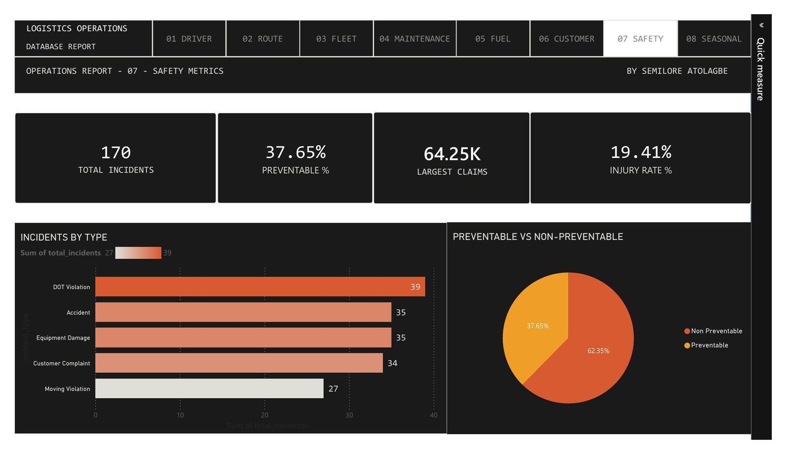
07 · SAFETY · Incidents by type, preventable vs non-preventable split, injury rate
170 Incidents · 37.65% Preventable · 19.41% Injury Rate
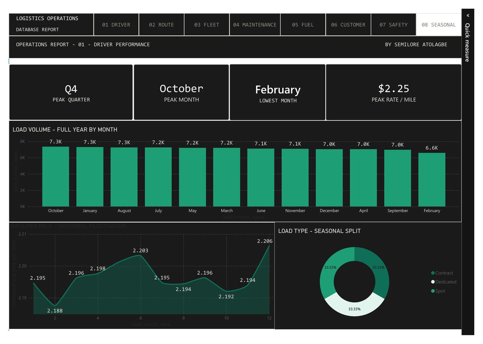
08 · SEASONAL · Rate/mile fluctuation, load volume by month, contract/dedicated/spot split
Peak: Oct @ $2.25/mile · Q4 strongest quarter
What Each Tab Is Actually Answering
#TabThe Operational Question
01
Driver Performance
Who are my top earners per mile, and is there a pattern in MPG across the fleet across the year? Surfaces underperformers and seasonal driver efficiency shifts.
02
Route Profitability
Which lanes are actually making money after fuel costs, and which are burning margin quietly? Revenue vs fuel cost per lane reveals the routes worth protecting and the ones worth dropping.
03
Fleet Utilization
Are we sweating our assets, or are trucks sitting? Utilization rate, revenue per asset, and miles by make tell you whether your capital is working or parked.
04
Maintenance
What's maintenance actually costing us, where is it concentrated, and is downtime trending up or down over time? The 2022–2023 comparison surfaces whether things are getting better or quietly worse.
05
Fuel Efficiency
At $95.59M in total fuel spend, even small MPG improvements compound massively. The monthly MPG trend and route-level fuel cost breakdown show exactly where to focus.
06
Customer Analysis
Which accounts are driving the most revenue, and what's the mix between contract, spot, and dedicated loads? Service level data shows where relationship risk sits.
07
Safety
Of 170 incidents, 37.65% were preventable, and that's the number a safety program needs to move. Breaking down by type (accidents, DOT violations, equipment damage) shows where to intervene first.
08
Seasonal
Rate per mile peaks in October and bottoms in February. Load volume follows its own curve. Planning resourcing, contracts, and pricing without this view means leaving money on the table twice a year.
The Stack
SQL
Data cleaning, database modelling, and structuring the relationships between driver, route, fleet, and financial tables before anything hit Power BI.
DAX
Calculated measures for revenue per mile, utilization rate, net margin per lane, seasonal rate averages, and the preventable incident split. The logic layer that makes the visuals meaningful.
Power BI
Eight dashboard tabs, consistent layout and navigation across all views, with cross-filtering so any selection on one chart updates the rest of the page.